Advanced analytics

Main page - general overview regarding functionalities

Gadget which allows you to view your data via Dependancy wheel

Gadget which allows you to view your data via Sankey diagram

Gadget which allows you to sum up data and display result in a bar chart

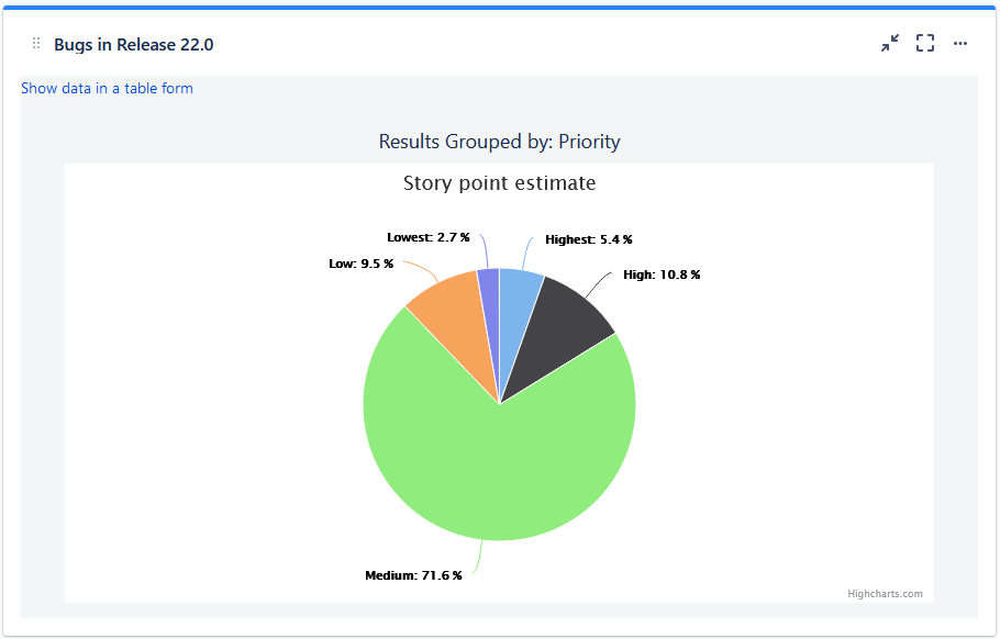
Gadget which allows you to sum up data and display result in a pie chart

Gadget which allows you to sum up data and data in a 2-d table
Sum up data using Pie chart gadget
Create tables containing data with multiple statistics. With this functionality, you can analyse whatever you need to.

Pie chart is typically used to compare part of the data compared to whole. You can for instance build overview showing which typical components your team works wit. This helps your team understand how big the specific type of work compared to other activities. Based on this information it’s easy to understand the current limitations which need to be worked on in order to build end to end teams. It will also help you to put progress of the release items in a report which can be used as a key input during a go/no-go meeting. You can also review amount of bugs introduced in specific releases in order to improve quality of your products.
Configuration
- Go to dashboard on which you're willing to place the Gadget
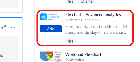
- Add Gadget called "Pie chart - Advanced analytics" to the dashboard
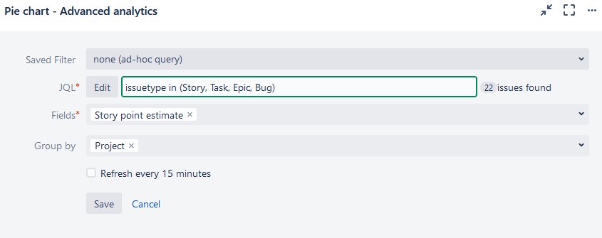
- Fill in the details on the gadget configuration screen
- Saved filter (optional)
- JQL - select data you want to show in the table
- Fields - select the fields you want to display in the table
- Group by - select parameter based on which you want to group your data.


4. Click on button "Save" and now you see statistics you wanted :)
