Advanced analytics

Main page - general overview regarding functionalities

Gadget which allows you to view your data via Dependancy wheel

Gadget which allows you to view your data via Sankey diagram

Gadget which allows you to sum up data and display result in a bar chart

Gadget which allows you to sum up data and display result in a pie chart

Gadget which allows you to sum up data and data in a 2-d table
General overview
This App for Jira® is designed to help you create statistics you need. You can sum up multiple data, count them and then display either in a table, or in a chart. We've also included a universal 2-d table so that you can combine different data and group them together. Works also with time tracking fields – so that you can work with performance driven data. This app includes:
- Gadget with possiblity to select many different data and count, or sum their values up
- Gadget with a 2-d table, where you can select what data will be displayed in rows & columns
- Bar chart to display counts / sum of values in a visual way
- Pie chart to display counts / sum of values in a visual way
- Sankey diagram / vizualize dependancies
Download here
What you'll get - some examples
Release statistics
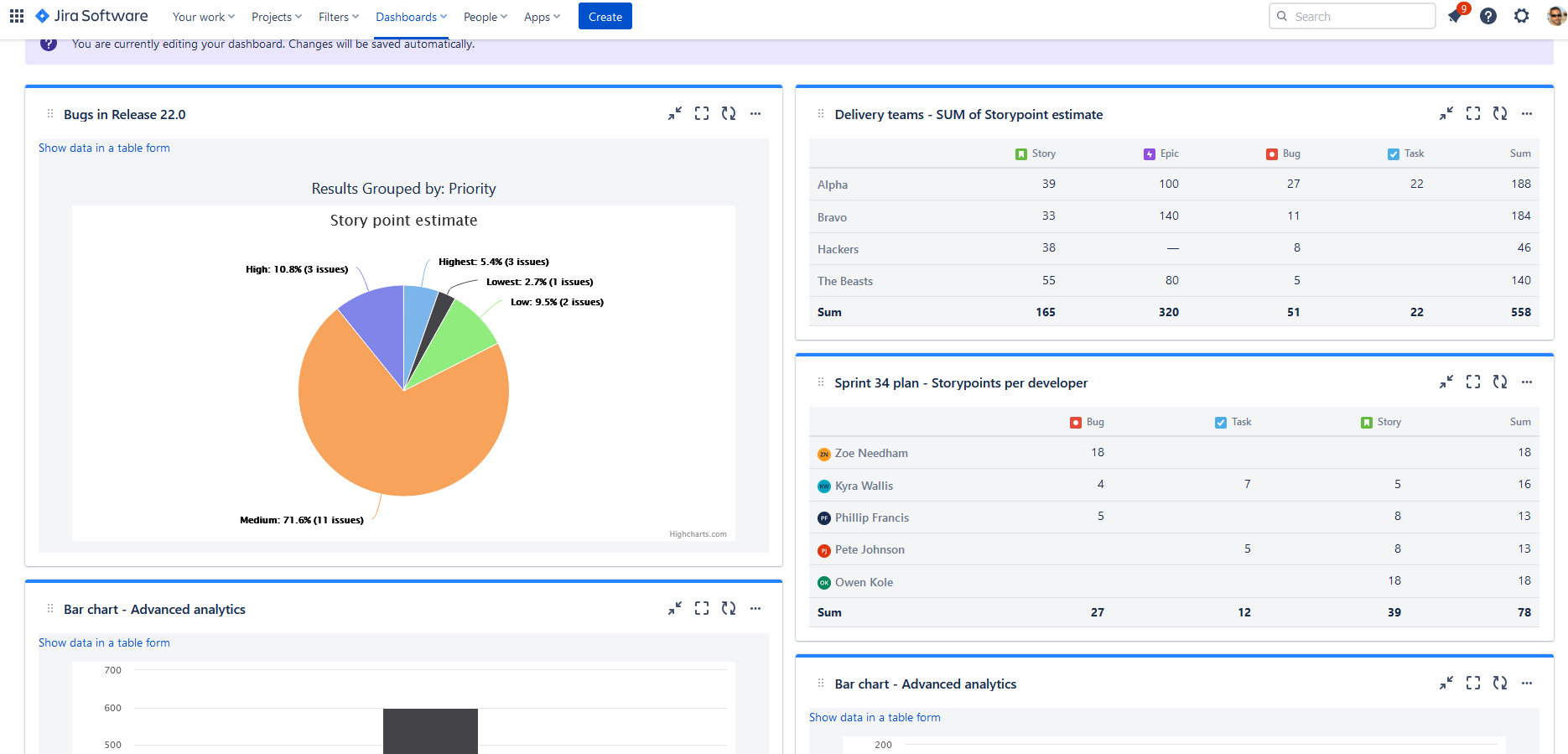
In order to deliver your customers a high quality service, or product, it is extremely important to measure quality. We offer you an opportunity to create online statistics, in which you will know exactly how many bugs there are and how much effort there is behind each type of criticality - by summing up the Story points for each category. Manage your customer's expectations - for detailed info on how to create such report, please see our Pie chart configuration.
Inter-team dependencies
Are your teams struggeling with delivering a single item? Do your releases always get blocked by having one team waiting for another? Are your release candidates breaking test environments over which nobody has visibility? We have a solution. See whether some of your teams represent a possible bottleneck in your system, or how many bugs were generated by each on every test environment. For more details, please see Sankey diagram configuration.
Dependency statistics
To be able to move towards high performing teams, it is important to understand thing in context. Do you for instance know how much does success of your team depend on activities in other teams? Our gadget will help you to get a holistic overview which will help you see also the strength of the interaction. In order to create such report, please refer to Dependency wheel configuration.
Cross-team statistics
Being able to see the full picture can lead to false interpretations, poor expectation management and even bad decisions. Don't worry - we've got this! With this table you will be able to see and compare things like ratio of activities managed by each team, or time spent on each type of work. How to configure this? Please see more details in 2d table gadget configuration.
Resource allocation
Have you ever wondered how much work does each of your team members have assigned before, during, or after Sprint planning ceremony? As you know, overloading the most skilled team members can lead to frustrations, or burnout. Not in our case - with our Bar chart gadget, you can create such report & see this any time you like! For more details, please see Bar chart configuration.